Origins and History of Web Design Web design did not start with designers. It started with scientists trying to share documents.
There is something slightly funny about looking at the first websites today.
They look unfinished.
There are no hero sections, no hamburger menus, no cookie banners, no animated gradients, no giant typefaces, no carefully chosen color palettes. Sometimes there is barely anything that could be called a "design" at all.
And yet, that is the interesting part.
Web design did not begin as a visual discipline. It began as a way of organizing information. The visual language came later, as people figured out what a browser could do, what HTML could express, what CSS could control, and eventually what designers could get away with.
The history of web design is, in many ways, the history of people trying to make an inherently flexible medium behave more like the physical media they already understood.
1990: Before web design was really a thing
Tim Berners-Lee invented the World Wide Web at CERN in 1989. The original idea was not to create a new publishing medium or a new kind of advertising platform. CERN needed a better way for scientists at different universities and laboratories to share information.
By the end of 1990, Berners-Lee had a working web server, browser and editor on a NeXT computer at CERN. The basic technologies behind the Web were already there: HTML, HTTP and URLs.
The first website ran at info.cern.ch and was dedicated to the World Wide Web project itself. CERN later launched a project to restore the first website.
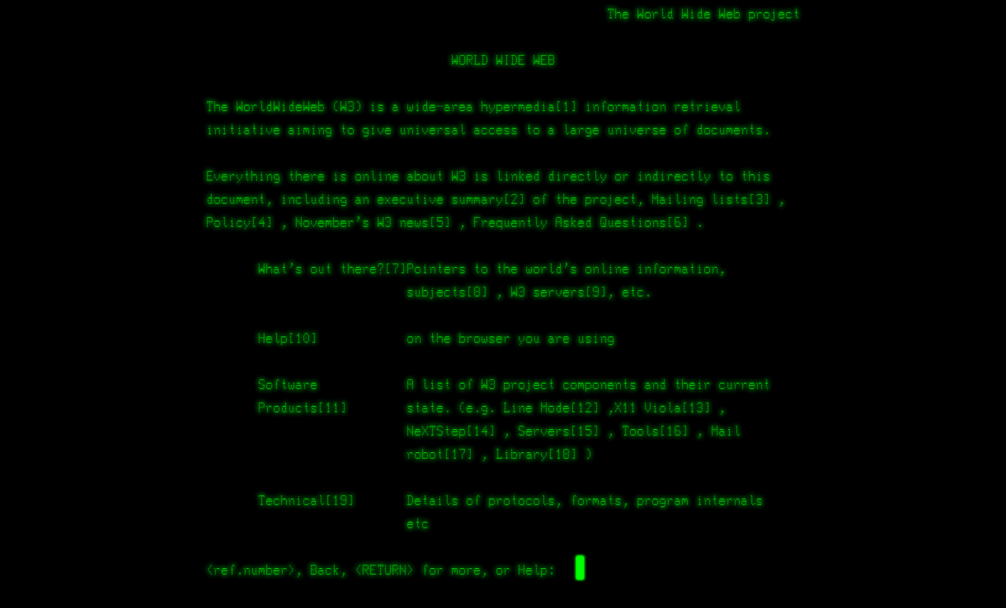
There is an important caveat here. The exact original 1991 page has not survived. CERN explains that the original page changed as the Web project developed, so there is no screenshot of the exact original page. What exists today is a reconstruction based on the surviving material.
That makes the restored page particularly interesting. It shows how little there actually was to "design."
The first website was documentation for the Web itself. It explained hypertext, how to create a server and how the system worked.
You can still visit the restored site at info.cern.ch.
At this point, "web design" mostly meant writing HTML.
1991-1994: The Web was basically documents
The early Web was closer to a collection of linked documents than the websites we know today.
There were headings, paragraphs, lists and hyperlinks. You could move from one document to another, but there was very little control over how those documents were presented.
This was not necessarily considered a problem.
HTML was designed primarily around the structure of information rather than its visual appearance. The idea was that the same document should remain useful regardless of what kind of computer or display was being used to read it.
That philosophy is still visible in HTML today.
A heading is a heading. A paragraph is a paragraph. A link is a link.
The browser decides much of the rest.
The first browser, WorldWideWeb, was actually more sophisticated than the first websites might suggest. It was both a browser and an editor, allowing users to create and modify documents directly. The problem was that it ran on NeXT computers, which very few people had.
CERN therefore developed the much simpler Line Mode Browser, which could run on a much wider range of computers. CERN describes the Line Mode Browser, launched in 1992, as the first readily accessible browser for the Web.
That accessibility mattered.
In 1991, the Web started spreading outside CERN. The first web server outside Europe was installed at SLAC in California, and CERN eventually released the Web software into the public domain in 1993.
That decision helped turn what had started as a research project into a global platform.
See CERN's short history of the Web for the timeline of these early developments.
1993: Suddenly, images
The Web became much more interesting when browsers started supporting images.
This sounds trivial now, but it fundamentally changed what a webpage could be.
Instead of a document containing text and blue links, a page could contain photographs, logos, illustrations and visual decoration.
One of the earliest famous examples was a photograph of the band Les Horribles Cernettes, uploaded at CERN in 1992. It is often described as the first photograph on the Web.
The arrival of graphical browsers such as NCSA Mosaic made this new visual Web much more accessible.
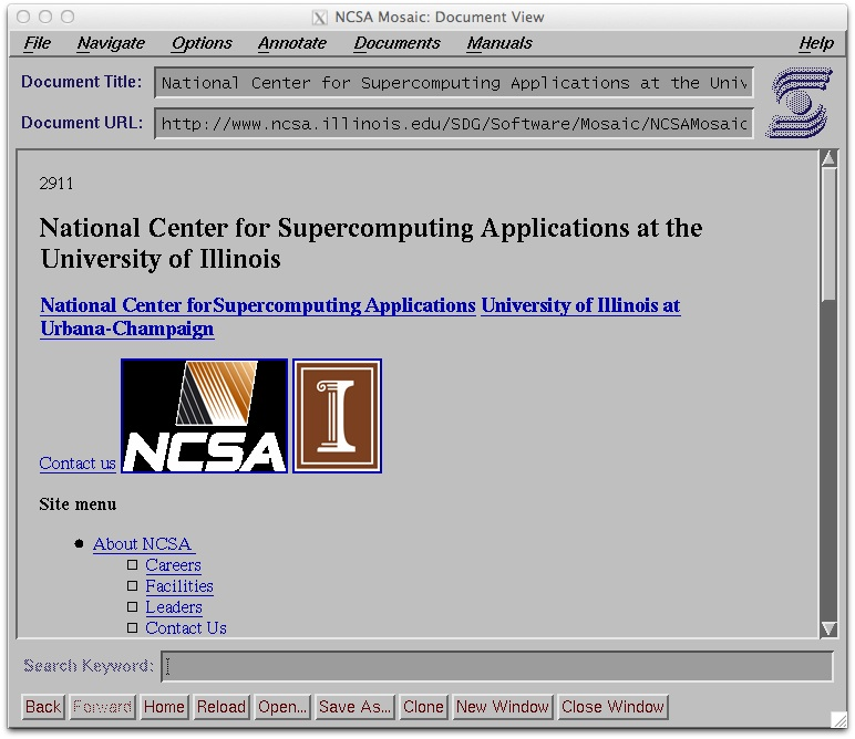

Mosaic was important not simply because it looked nicer. It ran on popular personal computers and helped bring the Web outside research institutions.
The Web was no longer just a document system.
It was becoming a visual medium.
And once designers had images, they immediately started trying to control where everything went.
The table era
Here is where web design starts looking familiar, at least in spirit.
HTML tables were intended for tabular information. But designers discovered that rows and columns were also quite useful for positioning things on a page.
Want a sidebar?
Make a table.
Want a header above three columns?
Make a table.
Want another box inside one of those columns?
Put another table inside it.
And another one inside that.
This produced some truly impressive constructions made entirely out of nested tables, transparent images and carefully calculated pixel dimensions.


The famous 1×1 transparent GIF, usually called a spacer GIF, became one of the strange little building blocks of this era. Designers could place an invisible image inside a table cell and give it a precise width or height, effectively forcing the browser to preserve a particular piece of the layout.
It was a hack.
But it worked.
And this is an important pattern in the history of web design: many techniques that later look ridiculous made perfect sense given the tools available at the time.
The problem was not that designers were stupid.
The problem was that the Web had not yet given them a proper layout system.
The Web becomes a visual playground
By the middle of the 1990s, websites were becoming increasingly colorful and experimental.
Background textures appeared everywhere. Animated GIFs became a thing. Buttons became images. Text became images. Pages acquired elaborate borders, beveled panels, tiny icons and decorative navigation bars.
And then there was .
The Web had discovered that just because you can animate something does not mean you should.
But the larger change was cultural.
The Web was moving from something primarily used by researchers and universities to something ordinary people could participate in themselves.
Personal homepages appeared. GeoCities exploded. Companies started creating websites. Newspapers moved online. Designers began treating websites as a legitimate design medium rather than simply documents with hyperlinks.
The web designer was becoming a real job.


1995-1999: The browser wars
There was another problem.
The Web was not controlled by one browser.
Netscape and Internet Explorer competed aggressively, and different browsers implemented HTML and CSS differently. Designers often had to test the same website in several browsers and add browser-specific tricks to make everything look approximately correct.
This created an unfortunate side effect.
Instead of asking:
What is the correct way to build this?
developers often had to ask:
What makes this work in Netscape?
and:
What makes this work in Internet Explorer?
The period helped create a strong standards movement around the idea that the Web should have a common technical foundation rather than every browser becoming its own platform.
The W3C's history explains how the organization was established in 1994 to coordinate Web standards and help maintain interoperability as the platform expanded.
1996: CSS changes the game
CSS was proposed partly because HTML was becoming a terrible place to put visual styling.
The first CSS specification became a W3C Recommendation on December 17, 1996. It provided a way to control fonts, colors, margins and other presentation properties without mixing all of that information into the document structure.
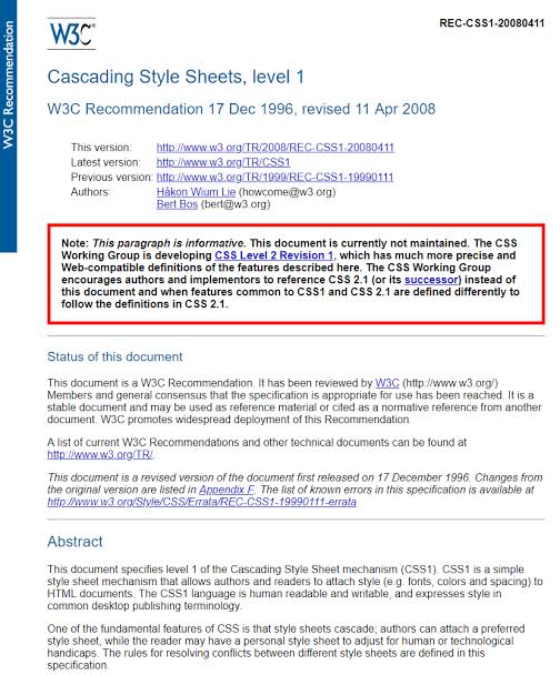
That separation seems obvious now.
At the time, it was a major change.
Instead of writing a document that essentially said:
this text should look like this
you could write HTML describing what the content is, and CSS describing how it should look.
The W3C's original CSS1 announcement specifically described CSS as a way to separate document structure from visual presentation and noted that designers had previously used images of text, proprietary HTML extensions and tables to work around HTML's limitations.
Read the original W3C CSS1 announcement.
But CSS did not immediately kill table layouts.
Not even close.
Browser support was inconsistent, designers were already comfortable with tables, and CSS itself was initially much less powerful than it is today.
For years, web designers lived somewhere between standards and hacks.
2000s: Web standards and the fight against hacks
By the early 2000s, a standards movement was developing around the idea that HTML should describe content and CSS should handle presentation.
This is the period when terms such as semantic HTML, tableless layout, web standards and accessibility became much more important.
CSS gradually became capable of doing things designers had previously used tables to accomplish.
And then came one of the best demonstrations of the idea.
CSS Zen Garden
In 2003, Dave Shea launched CSS Zen Garden.
The concept was almost ridiculously simple: everyone received the same HTML document. Designers could change the CSS and images, but not the underlying HTML.
The result was hundreds of radically different visual designs produced from exactly the same structure.
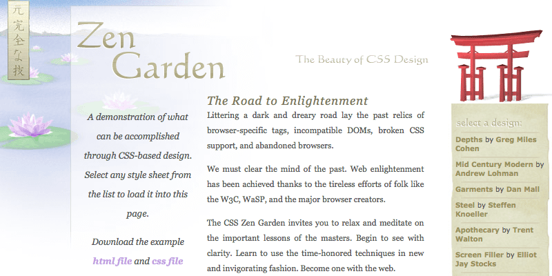
This was more than a collection of pretty websites.
It demonstrated something fundamental:
Content and presentation did not have to be the same thing.
The HTML could remain untouched while the visual design completely changed.
That idea sounds mundane today. In 2003, it was a powerful demonstration of what CSS could actually do.
2000s: Flash takes over the flashy part of the Web
There was another path web design took during this period.
Flash.
If CSS represented one direction of the Web, Flash represented almost the opposite.
Flash allowed designers to create animations, elaborate interfaces, sound, games, interactive menus and entire websites that behaved more like desktop applications.
And designers loved it.
A Flash website could ignore many of the browser's normal limitations.
You could design the entire experience inside one Flash movie.
The downside was equally obvious in hindsight. Search engines, accessibility tools, mobile devices and users without the plugin could have a very different experience.
Flash also tied a large part of the Web's visual future to proprietary software.
Eventually, open Web technologies caught up.
Adobe officially ended support for Flash Player on December 31, 2020, and blocked Flash content from running beginning January 12, 2021.
Adobe specifically pointed to technologies such as HTML5, WebGL and WebAssembly as mature alternatives. See Adobe's Flash Player End of Life announcement.
2007-2010: The screen gets smaller
Then the smartphone arrived.
The desktop monitor was no longer the only screen designers had to think about.
Suddenly, a website might be viewed on a 24-inch monitor, a laptop, a small netbook, an iPhone or a tablet.
The old assumption that you could design one fixed canvas and expect everyone to see it the same way started falling apart.
For a while, one common answer was to create separate mobile websites.
Then, in 2010, Ethan Marcotte published an article in A List Apart called Responsive Web Design.
The idea was not completely new. Flexible layouts and other techniques already existed. What Marcotte did was bring several of them together under a single concept: fluid grids, flexible images and media queries.

The important realization was that the Web does not have a fixed canvas.
A printed poster has a physical size.
A webpage does not.
The same document can be displayed at 320 pixels wide, 1440 pixels wide or somewhere in between.
Responsive design stopped treating this as a problem to eliminate and started treating it as a characteristic of the medium.
2010s: The Web becomes an application
The next major change was not purely visual.
Websites became applications.
JavaScript became dramatically more capable. Browsers became faster. APIs became richer. CSS became much more powerful. HTML gained elements designed for modern applications and multimedia.
The distinction between a "website" and a "web app" started becoming increasingly blurry.
Google Docs could behave like a desktop application.
Online maps could behave like desktop software.
Social networks could update without reloading the page.
And web design had to account for all of it.
The designer was no longer just designing pages.
They were designing states, interactions, loading experiences, forms, navigation systems, notifications and increasingly complicated interfaces.
2014: HTML5 becomes a milestone
HTML5 became a W3C Recommendation on October 28, 2014.
It introduced new elements and capabilities intended to better support modern web applications and multimedia, while also improving interoperability and providing clearer conformance requirements.
Elements such as , , , and made it easier to express the structure of a page semantically.
Meanwhile, , , and other technologies reduced the need for plugins such as Flash.
Read the original W3C HTML5 Recommendation.
The modern era: CSS becomes ridiculously powerful
If someone from 1995 could see modern CSS, they would probably think it was some kind of programming language.
We now have Flexbox.
Grid.
Custom properties.
Transforms.
Transitions.
Animations.
Container queries.
Variable fonts.
Logical properties.
clamp().
min() and max().
And far more.
The interesting thing is that modern CSS has made some of the old tricks almost impossible to imagine.
You no longer need a transparent 1×1 GIF to create a 20-pixel gap.
You don't need a table to create three columns.
You don't need an image containing text just because you want a particular typeface.
And you certainly don't need to build the entire page inside a Flash movie.
The browser has become the design tool.
And then the pendulum started swinging back
Something interesting happened after all this progress.
Websites became extremely sophisticated.
Then they became extremely complicated.
A modern website can contain dozens of JavaScript bundles, tracking scripts, analytics systems, advertising systems, cookie-management systems, animations, third-party widgets, web fonts and increasingly large frameworks.
At the same time, there has been renewed interest in something that looks remarkably similar to the earliest Web:
simple HTML.
Fast pages.
Plain links.
Readable text.
Minimal JavaScript.
Websites that work without an enormous application runtime.
This does not mean the Web is going backward.
It means that after thirty-five years of experimentation, we have learned that the browser itself is often enough.
The first website did not need a framework.
It did not need a component library.
It did not need a design system.
It did not even need CSS.
It was a collection of information connected by hyperlinks.
And somehow, that idea is still at the center of the Web.
So what actually changed?
Looking at the history as a whole, web design went through a surprisingly recognizable sequence:
Documents → decorated documents → layouts → visual design → interactive applications → responsive systems → back toward simpler systems.
The tools changed constantly, but the underlying problem stayed the same:
How do you present information to someone through a screen you do not control?
In 1991, the answer was basically:
Here is the document. Your browser decides how it looks.
In the late 1990s, designers tried to take control:
Here is exactly where everything should go.
In the 2000s, designers started separating structure from presentation:
Here is the content. CSS will decide how it looks.
In the 2010s:
Here is the same content, but it needs to work everywhere.
And today:
Here is the content. Let the browser do more of the work.
That last idea might actually be the most interesting part of the history.
The Web was never really designed to be a digital version of a printed page. We spent decades trying to make it behave like one anyway.
Maybe the most mature form of web design is accepting what the medium has always been:
a flexible document that can become almost anything.
Sources and further reading
- CERN: The birth of the Web
- CERN: A short history of the Web
- CERN Document Server: Screenshot of the recreated first website
- W3C: History of the World Wide Web Consortium
- W3C: A brief history of CSS
- W3C: CSS1 Recommendation announcement
- CSS Zen Garden
- Ethan Marcotte: Responsive Web Design
- W3C: HTML5 Recommendation
- Adobe: Flash Player End of Life
- Wikimedia Commons: NCSA Mosaic Browser Screenshot
- Wikimedia Commons: Spacer GIF
 Forward: arazgray.com/origins-and-history-of-web-design